Propensity score plotting for Matched objects
Source:R/AllGenerics.R, R/methods-Matched.R
plotPropensity.RdThis function plots the distribution of propensity scores from each matched set of a Matched object.
plotPropensity(
  x,
  sets = c("focal", "matched", "pool", "unmatched"),
  type = NULL,
  log = NULL,
  ...
)

# S4 method for class 'Matched,character_OR_missing,character_OR_missing,character_OR_missing'
plotPropensity(x, sets, type, log, thresh = 12)
Arguments
- x
Matched object
- sets
Character vector describing which matched set(s) to include in the plot. Options are 'focal', 'matched', 'pool', or 'unmatched'. Multiple options are accepted.
- type
Character naming the plot type. Available options are one of either 'ridges', 'jitter', 'lines', or 'bars'. Note that for large datasets, use of 'jitter' is discouraged because the large density of points can stall the R-graphics device.
- log
Character vector describing which axis or axes to apply log-transformation. Available options are 'x' and/or 'y'.
- ...
Additional arguments.
- thresh
Integer describing the number of unique values required to classify a numeric variable as discrete (and convert it to a factor). If the number of unique values exceeds
threshthen the variable is considered continuous.
Value
Returns a plot of propensity score distributions among matched sets.
Details
plotPropensity uses the thresh argument
to determine whether to plot propensity scores as
continuous (line plot) or catetgorical (bar plot).
These settings can also be overwritten manually.
See also
plotCovariate() to plot covariate distributions.
Examples
## Matched example dataset
set.seed(123)
mdf <- makeExampleMatchedDataSet(matched = TRUE)
## Visualize propensity scores
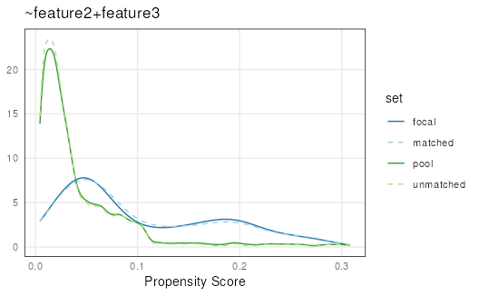
plotPropensity(mdf)
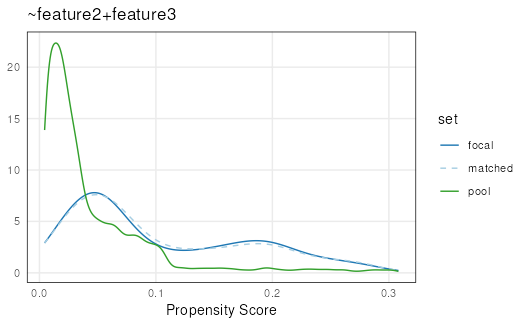
 plotPropensity(mdf,
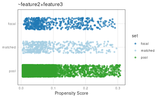
sets = c('focal', 'matched', 'pool'))
plotPropensity(mdf,
sets = c('focal', 'matched', 'pool'))
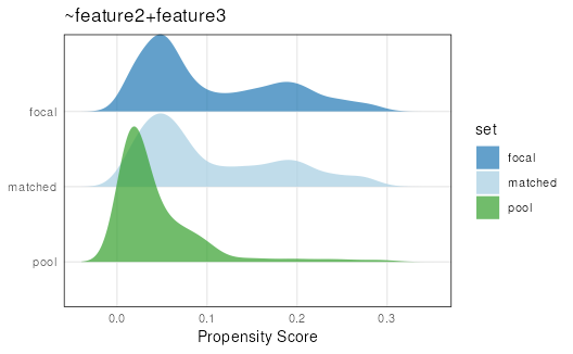
 plotPropensity(mdf,
sets = c('focal', 'matched', 'pool'),
type = 'ridges')
#> Picking joint bandwidth of 0.0148
plotPropensity(mdf,
sets = c('focal', 'matched', 'pool'),
type = 'ridges')
#> Picking joint bandwidth of 0.0148
 plotPropensity(mdf,
sets = c('focal', 'matched', 'pool'),
type = 'jitter')
plotPropensity(mdf,
sets = c('focal', 'matched', 'pool'),
type = 'jitter')